I'll start things off by letting you know that this my first try at a Fanpost of any kind and, as a non-native speaker, you may encounter the occasional spelling or grammar mistake. You've been warned.
This is something I've wanted to talk about for a while now and with the Minnesota Timberwolves revealing a new logo last night - that, I believe, will come with new uniforms next season - it seemed like a good time to write a Fanpost.
The Denver Nuggets are starting a new era. Long are the days when Melo was the star of the company and our chance at winning it all. The new gang is led by a 6'10'' European guy who looks like anything but a basketball player. Times have changed and so has the team. It's the perfect time to bring out a fresh look. Besides, your Denver "average Joe" doesn't have the best opinion about the direction the franchise has taken in the last few years and a change can, even subconsciously, help separate the current team from the past ones.
I'll focus my attention on three aspects: logo, color scheme and uniforms.
Logo
The current logo is outdated. According to Sportslogos.net, the design made its debut in the 93/94 season. It's a typical 90's logo, big and full of details and shapes that aren't needed. Nowadays, designs are made under the motto "Less is more". If we take a look at the recent logo updates that have been made throughout the Association we can notice a pattern. Simple designs with the circular shape being predominant:
(hope it's OK to use the logos, I took them from the teams' official websites. If my interpretation of the Photos FAQ is correct there shouldn't be any issue)
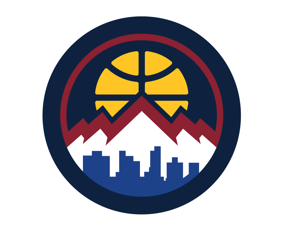
The good news is that we already have one of those, the Nuggets current secondary logo fits the mold. For me, the ideal solution would be upgrading it to primary and come up with something new for secondary. The logo has been around for quite some time now and it's instantly recognized league-wide as part of the Nuggets brand so half the work is already done.
Color Scheme
I don't dislike the powder blue and gold but for me it's always going to be the colors of the Melo years. My first thought was going back to the navy blue, red and gold but New Orleans kinda stole that one. Why not the rainbow skyline then? A modern version of the jerseys that the Nuggets wore in the 80's and early 90's has the potential to be great. It can also backfire big time if the designers don't nail it. Big risk, big reward situation. Currently, the Nuggets have a retro skyline jersey. They wore it in the home-opener against Portland, game in which Dikembe Mutombo saw his #55 jersey being retired by the organization and, truth be told, I liked having the old jerseys back.
Uniforms
Denver made small changes to the uniforms a couple of seasons ago. Fonts colors and one or two details, not much more. Although small, this tweaks brought new life to one of the most boring uniforms in the NBA. It certainly looks better now.
Next season, Adidas will be replaced by Nike as NBA's official clothing brand. We still don't know what practical changes that will bring. I presume the current jersey designs are property of the teams, not Adidas, so Nike will be able to use them. Still, this is the perfect time to change uniforms even if for Denver, it only makes sense if it comes with a change of color scheme.
Well, there's not much more I can say about the uniforms without repeating what I said above as the jerseys go hand in hand with the color scheme so I won't go further.
To sum up, it's my opinion the franchise needs a new look. Time to embrace the change and the evolution of the roster. Get the average fan excited about the team and bring people to the can. A packed arena can go a long way for a young team fighting an uphill battle against the very best in the world. Having a real home court advantage can be the difference maker. The marketing department should also be looking for better ways to promote the brand and the team. The time for action is now, do it now and get a big return later.
Feel free to comment and give you're opinion below and, once more, sorry for the language mistakes I'm sure I've made throughout the Fanpost.
